OffTheirPlate - Designer and Website Manager

Product, Website, Brand Design (Spring - Summer 2021)

Tools: Figma, SquareSpace, CSS, Slack, Google Drive

Collaborators: Creative-Studio Team (Wilfred Tso, Neelie Kiebler, Liz Martindale, Emily Martin, Danny Miller, Jaclyn Huang, Jocelyn Ueng, Julia Giammatteo, Michelle Huang)

Brand Book and Brand Development

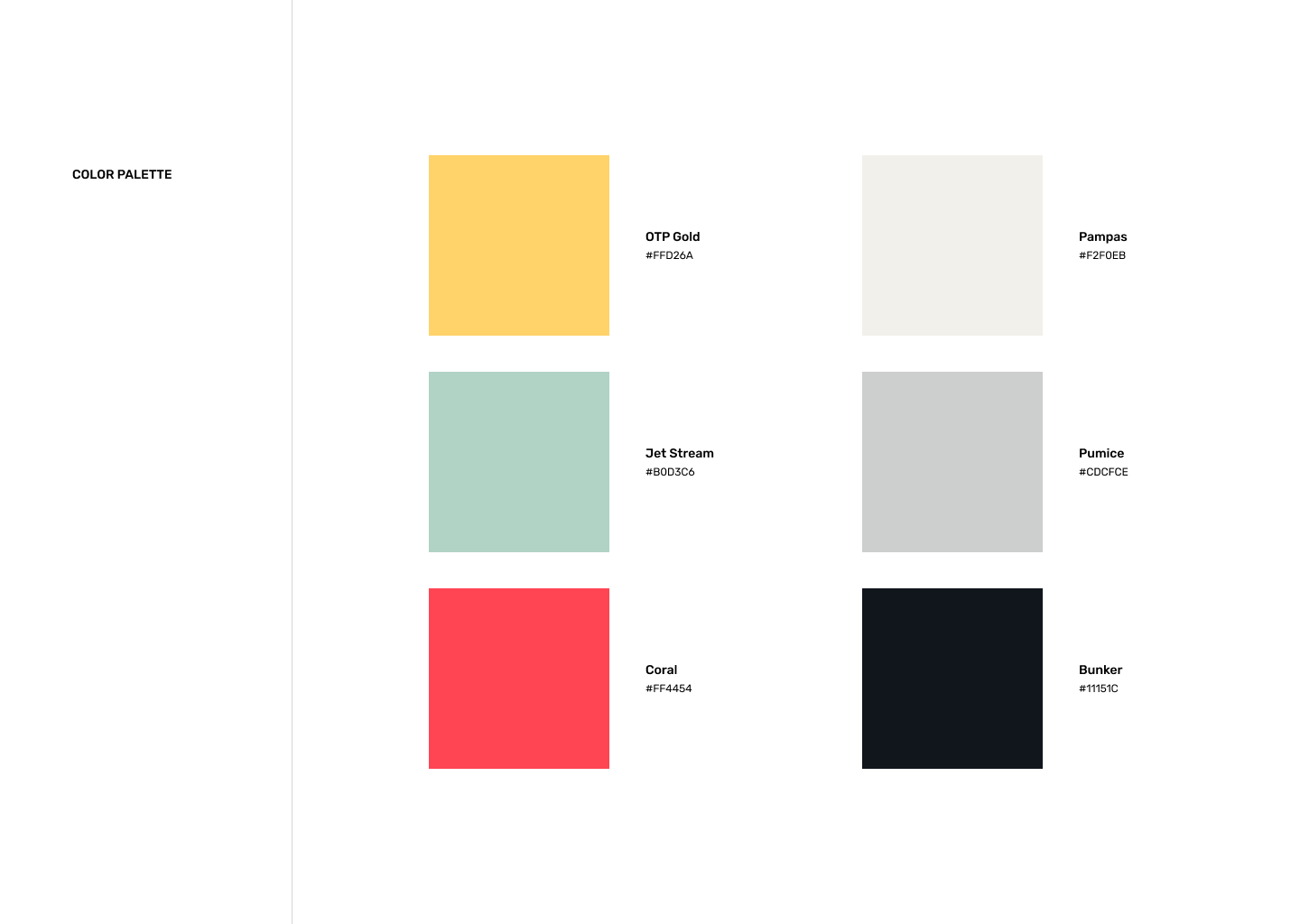
As the creative team for OffTheirPlate (OTP), I, alongside Liz, Emily, and Danny, worked on building a brand book for the new brand of OTP to fit the post-COVID19 repurposing of the organization to provide economic aid to food industry with an emphasis on BIPOC and AAPI communities. First, we had a discussion about what the aesthetic and vibe of the new company should be. It was important for us to identify what our main demographic was and to present ourselves in a way that aligned with OTP's mission and values. After interal conversation and polling from both the rest of the OTP volunteer team and some random outside spectators, we decided to do something uplifting, a bit child-like, and very happy. As such, we chose a very vibrant primary color scheme with a more neutral secondary color scheme, as seen below.

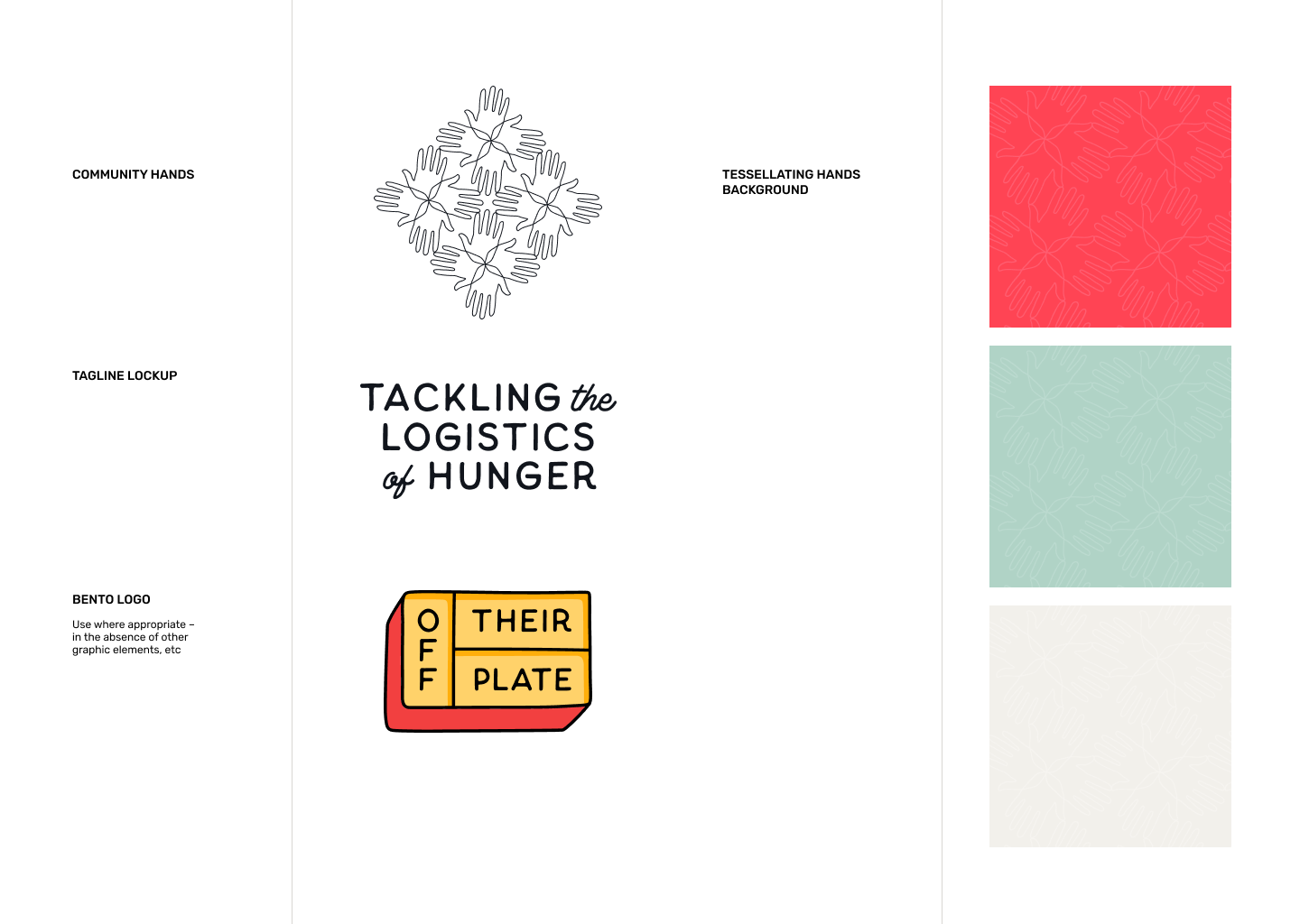
Liz and I were able to create a beautifully simple logo concept using overlapping, playful circles with the “Off Their Plate” text using the same yellow and red from the colors above to maintain cohesiveness. We also included how it could be used alongside images or with our visual assets.

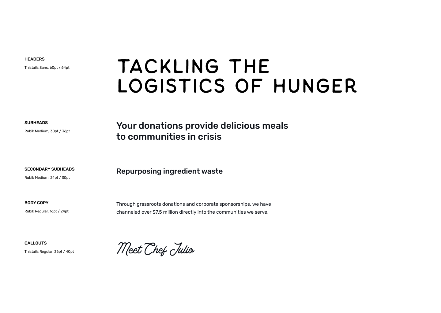
The typography itself is also quite playful and uses only sans serif fonts to give a more modern and playful feel to the company’s brand. The header font, Thistails Sans, is incredibly playful and reminiscent of comic sans while retaining some sense of professionalism, while the rest of the body text uses more standard fonts for easy accessibility and readability. We decided to make accent font used for callout and highlighted text pseudo-caligraphic to stand out from the rest of the sans-serif text, but we struggled finding a font that was still easily legible. In the end, Thistails Regular worked out well because it struck the balance between standing out and still being readable.

In flushing out the visual aspect of our brand, we built our background design, using white tesselating hands on our brand colors to maintain cohesivity while also adding some visual stimulation. The tesselating hands themselves are meant to symbolize community and how each of us, when put together, all come together to make some beautiful. In addition we created a visualization to our tagline “tackling the logistics of hunger” using our main font “Thistails”.

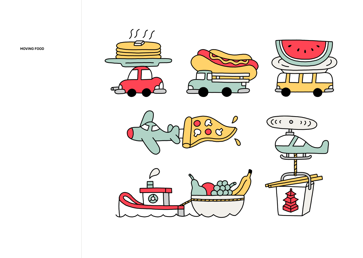
Our amazing illustrator, Danny was able to use the colors and conversation from our meeting to create this playful and cute illustrations showing the blending of transportation and food, playing on how our food industry and economy is essential.

Main Website

In collaboration with the writing, photography, and partnership investment teams, I was able to build the organization’s website via SquareSpace. I heavily relied on the images sent in by the photography team and the brand book the creative team made together as inspirations for the site’s layout, and focused mainly on highlighting images and using a small amount of words to highlight what was most important. All of the site’s calls to actions were made yellow to stand out and the I decided it was best to use the green and cream the main background colors because they were more cool and neutral, so that the black text and yellow calls to action could pop more. You can view the site here.

Second Helping's Website

During the beginning of the sumemr season, I took the initiative of researching potential resources and products that struggling restaurant owners would want/need. After a 50+ response survey, we decided on creating a blog/resource secondary site for OTP called “Second Helping.” The only feedback I received from the rest of the team was “match the branding of the main OTP site” and “showcase our articles in a blog style format”, and so I worked off of the current visuals of the existing OTP site. The only thing I changed in terms of branding was using the dark navy blue based off of the branding of Second Helping, but the navigation was meant to feel similar to the OTP site. However, I designed this site keeping in mind that the main demographic is no longer the general public, but instead chefs and restaurant owners that are interested in the research and resources OTP freely provides to aid the restaurant industry.

Since the main function was to show our published articles, resources, and research, I categorized the work into 2 sections, industry reports and resources. Both of these are presented as clickable windows that will lead to previewable pdfs that can be downloaded. I formatted them to be in a horizontal display gallery, that can be scrolled through, where each window displays the main information within each article (i.e. “Disparities Amongst BIPOC-Owned Restaurants in America”).

While this site is still in construction, you can view sections of my wireframe by visiting this figma file link.