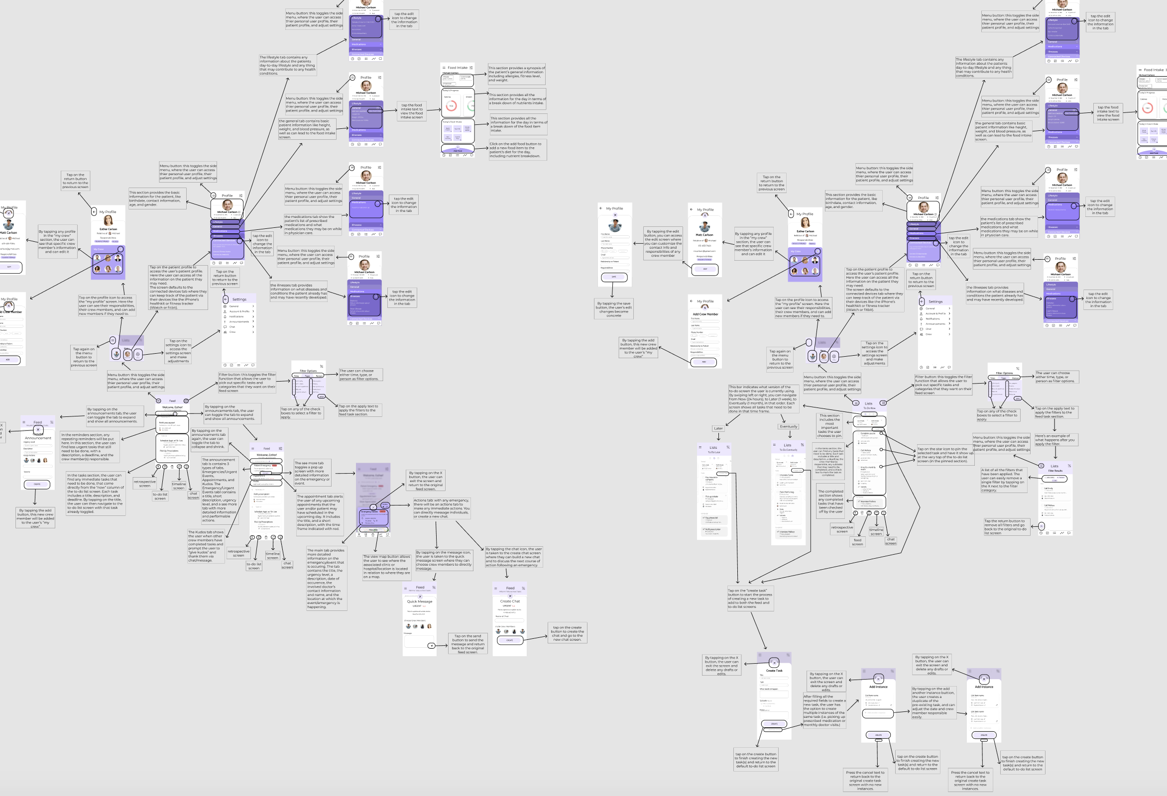
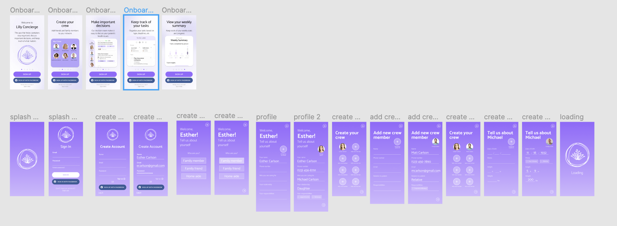
Since our timeline was so short (3 months) to create the app from start to
finish, the design team had to
expedite the
wireframing process as much as possible. Because of this, we designed a
high-fidelity wireframe using figma.
Team
members were split to work on different screens individually but collaborated to
create a cohesive design that
matched
across the board (iconography, buttons, fonts). We went through 6 different
iterations of the wireframing
process,
going
through experimentation, user testing, and manager approval, to create our final
wireframe, prototype 1.6. I
specifically worked on the home, profile, and setting screens.
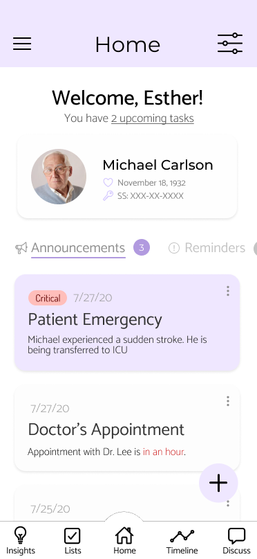
The home screens are the initial screens the user sees upon logging into the app,
so the intention behind the
design was
to give all the urgent information that the user might need to see. The user is
able to see how many tasks they
have and
a summary of their patient’s profile information, alongside a column of
information, announcements, reminders,
or
tasks.
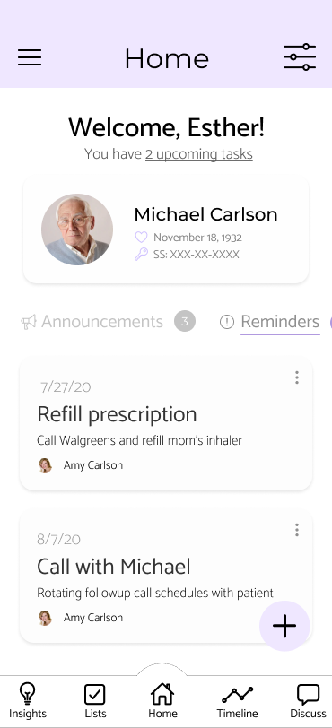
Announcements include any urgent updates on the status of their patient, any
upcoming events/appointments, and
emergencies. Reminders provide notifications for recurring tasks like picking up
prescriptions or routine
visits.
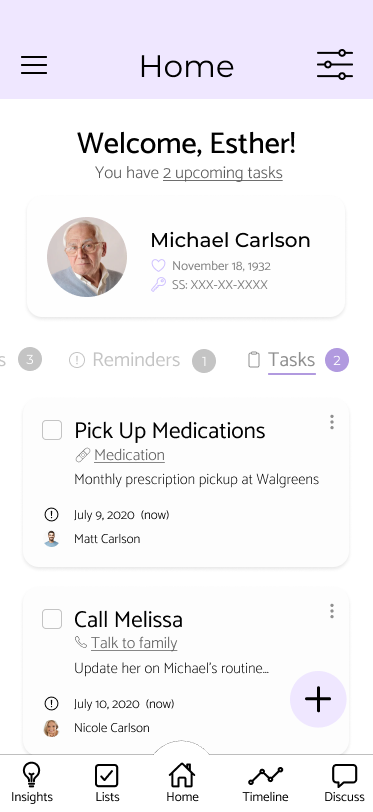
Tasks
provide a short summary of the upcoming tasks the user has been assigned, and is
linked to the to-do list
screen.
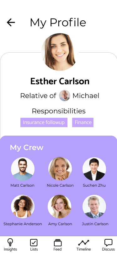
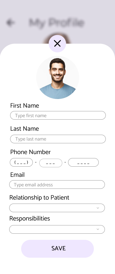
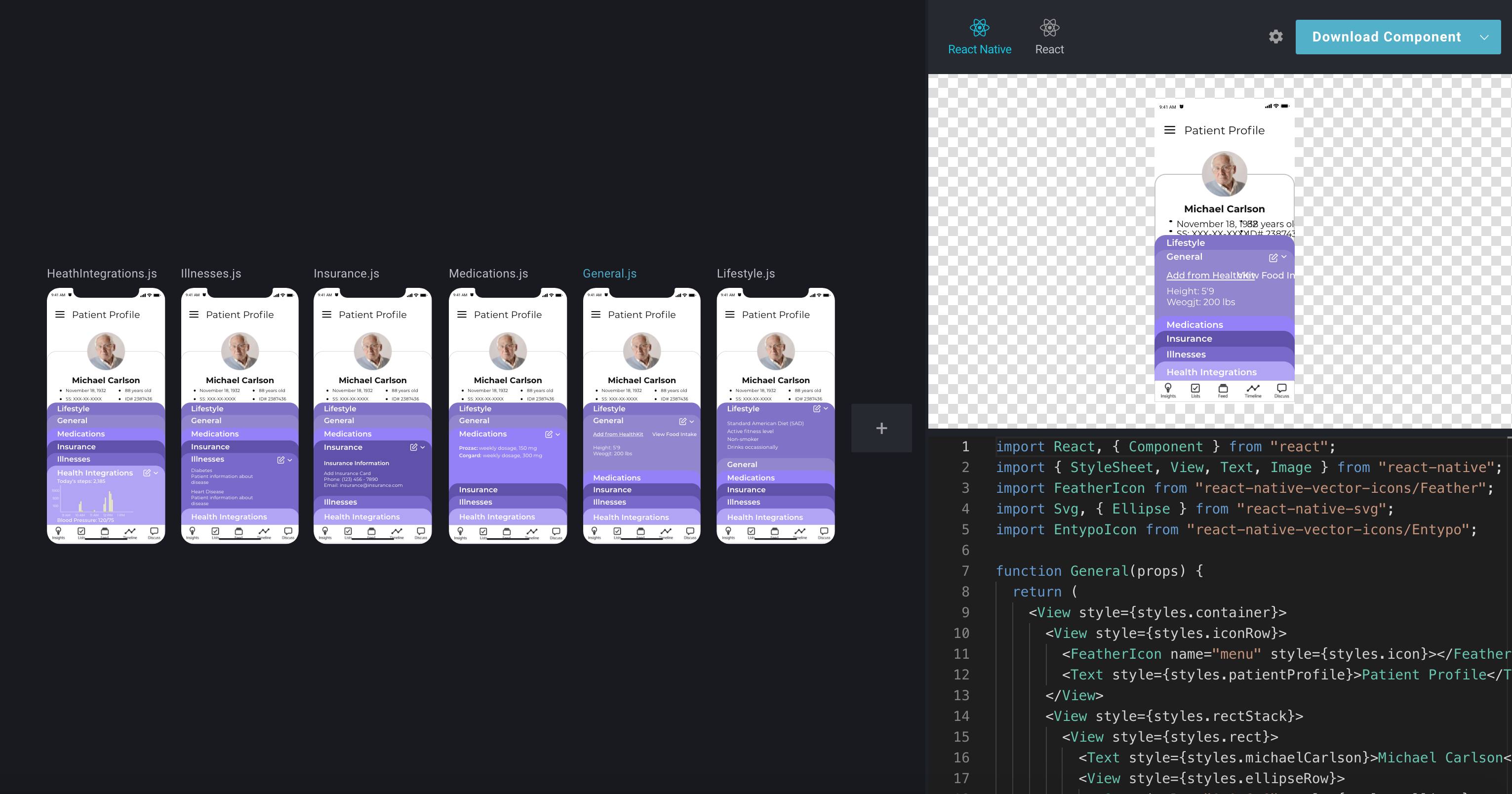
The profile screen provides the user with all the information they can upload on
the app, from contact
information to
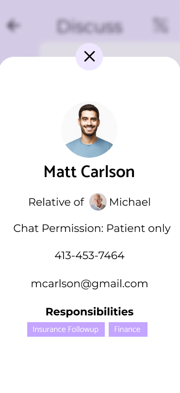
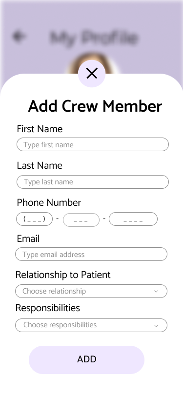
responsibilities to crew members. From this screen the user can also look at
individual crew members who they
work
with
(usually family and family friends), edit their own contact information, and
edit the contact
information/responsibilities for crew members.
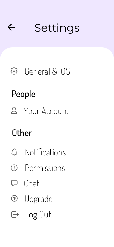
The settings screen in itself is extremely simple and displays the main
categories that a user can
adjust and customize to their liking. After many iterations of user testing, our
UX research and UX
design teams were able to collaborate and decide on the categories of
General/iOS, Your Account,
Notifications, Permissions, Chat, Upgrade, and Log Out, since they are all
general categories that
users all wanted to be able to adjust. Some examples are changing contact
information or the members
of a user's crew, how notifications would be delivered to a mobile device, and
how the chat UI would
function for each user. Here, moreso than anywhere else in the app, the
iconography was integral to
delivering the right information and so we had 3 iterations of user testing with
different icons from
the ionicon library to get our final outcome.
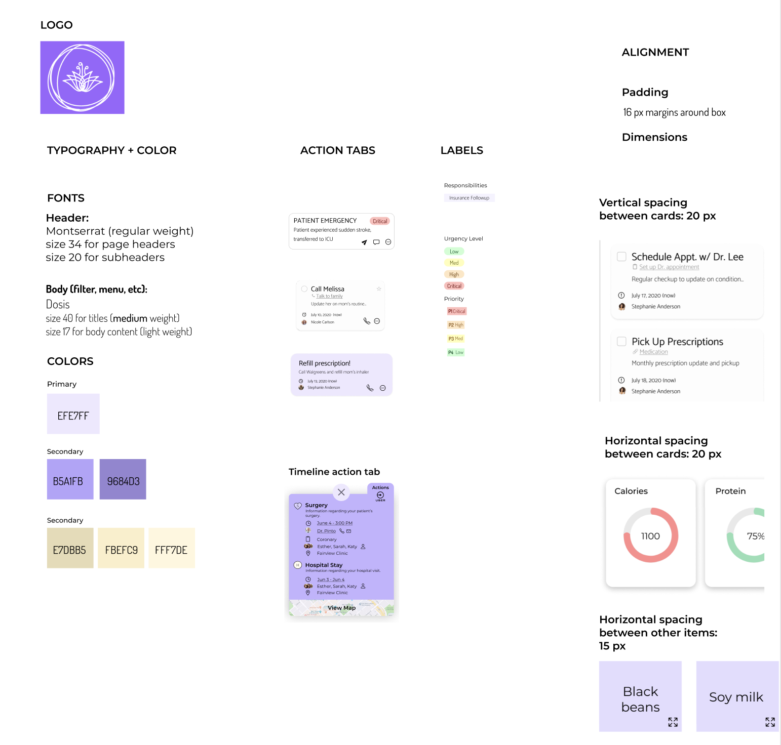
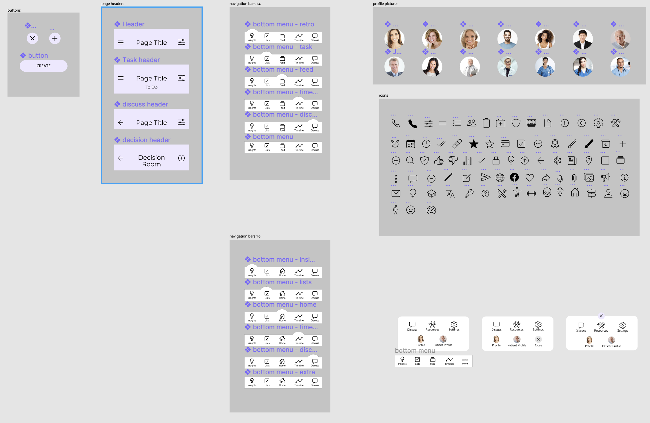
Alongside the screen designs, I was resposible for creating a thorough
walkthrough of every screen in
the app and how each one linked to the next. The whole design team was also
tasked with creating a
holistic style guide and design system so that both the design and software
engineering teams could
keep screen elements consistent across the board.