Project 1: Design System Cleanup and Documentation
The design system (June 2021), while organized well into separate files and pages based on type of information (base, components, icons, etc), had a lack of documentation, redlining, and overall polish. I was tasked with cleaning up the design system in its entirety. At the time, the design system, at it’s best, was a sticker sheet that had components grouped together, but with no way to know how/when to use variations of components, such as buttons or headers.
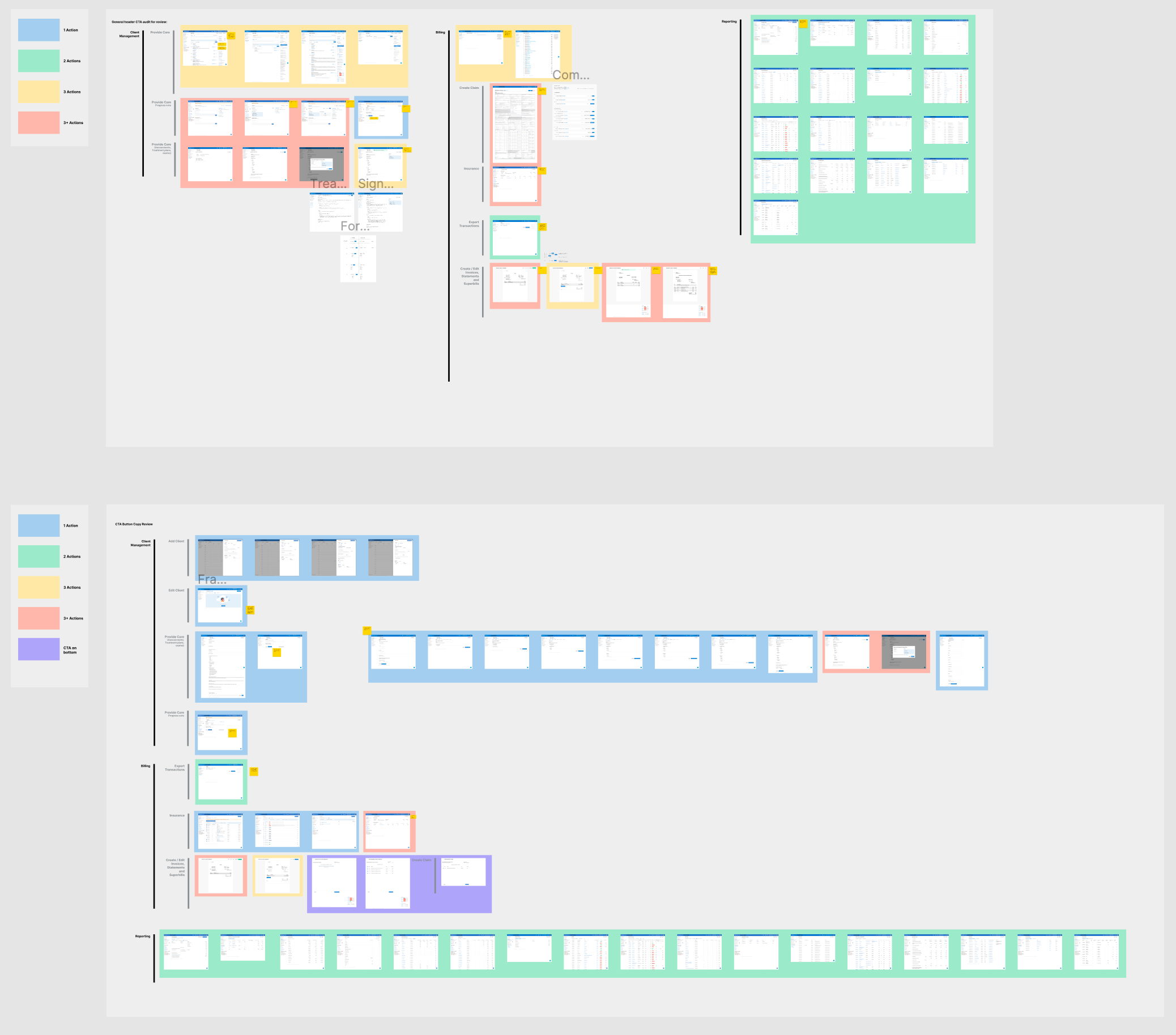
After an initial audit of the entire design system, I found 3 main factors that when improved altogether would enhance the design system greatly: navigation, documentation, and context.
Navigation: After syncing up with other designers on the team and reflecting on my own onboarding experience with the design system, I realized that the design system was difficult and unintuitive to navigate. Although components were organized well, navigating from page to page and finding specific components was difficult. To combat this, I did 3 things:
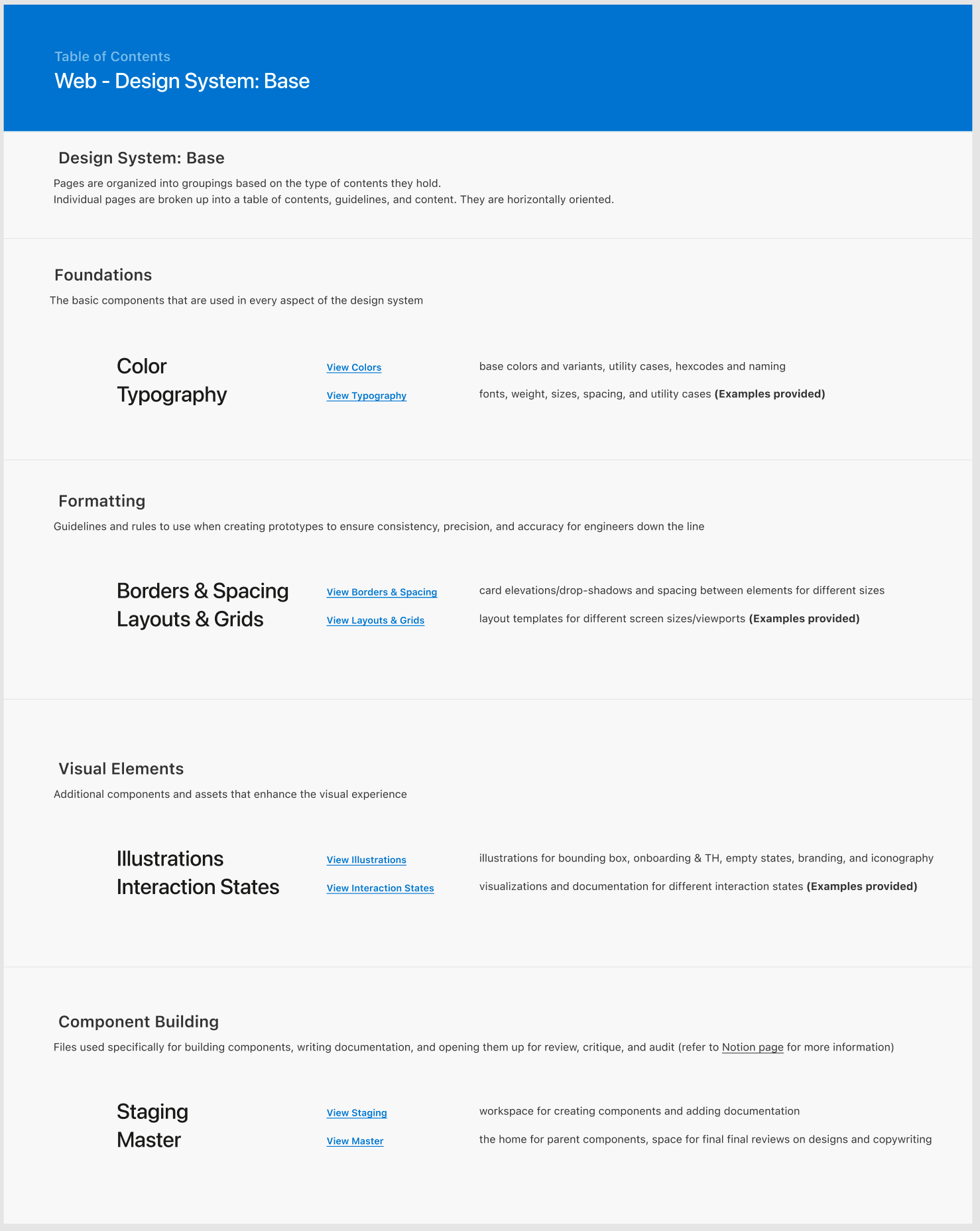
- I built a table of contents landing page where designers were able to see an overview of the exact contents of each page. This table of contents contained the page title, description, and clickable link for easy navigation. I added two ways to view this table of contents: 1 on the design system file in Figma, and one in our design team’s Notion page, both of which you can see here.
- I formatted each page the same way to add some logical reasoning as to how to navigate each page. Before, each page was organized individually and uniquely, so I reorganized files to be viewed horizontally. This way, each page reads like a book.
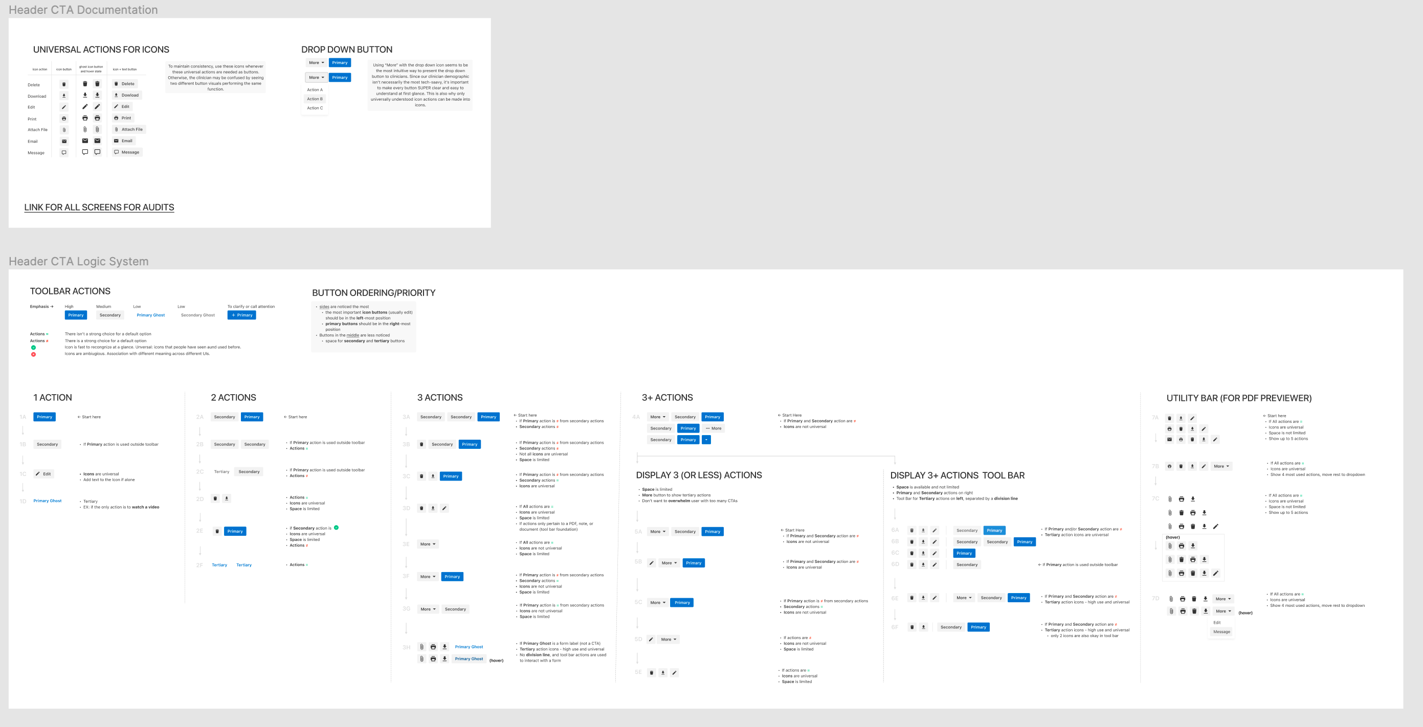
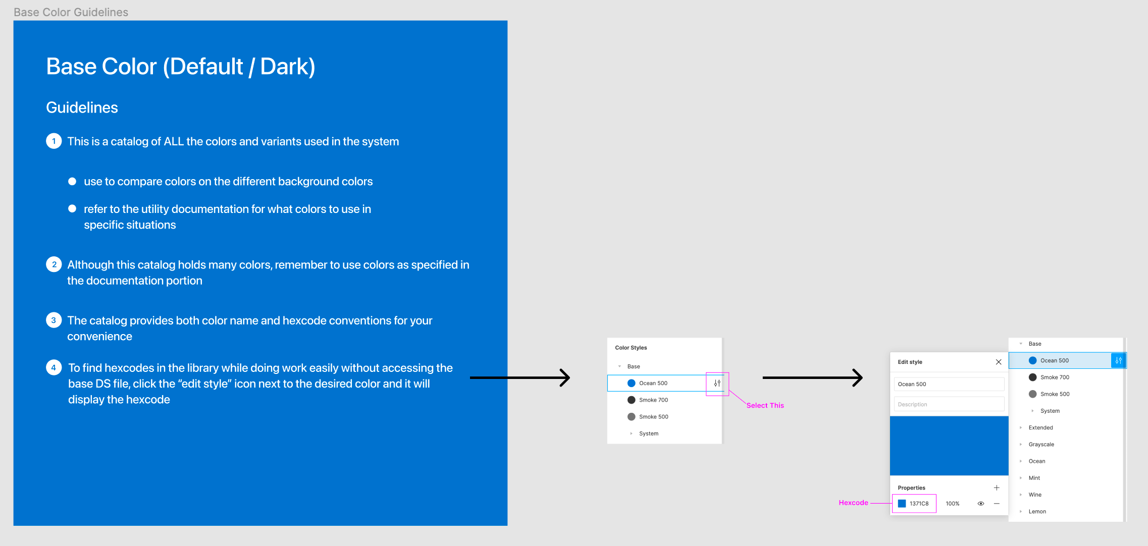
- One huge complaint I heard from designers across the board was a lack of searchability and visibility for components, specifically icons. So, I went about researching a new naming convention with alternate name tags so that figma’s built-in component search function would work more optimally for designers.
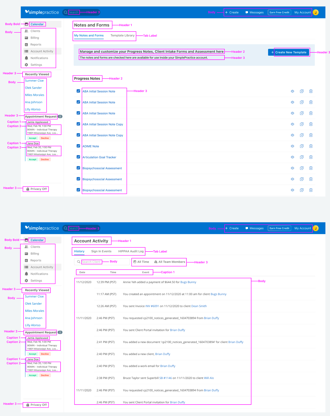
Documentation: In general there was a lack of documentation and commenting in the design system, making it difficult to know what exactly a designer is looking at. To fix this, I added a guidelines caption to every frame that summarizes the exact contents.
Context: To add to documentation, I also added screenshots and examples pulled from SimplePractice products to show how the components should be used when designing and how they appear in reality when launched.