Design and Wireframe
Originally being the head of the web development team, I first worked on building a Notion system that would aid in project management and organization. In terms of work flow, I organized it into a 2 week-sprint system, and scheduled weekly meetings with the web team, as well as one for me and the design team lead. From there, I coordinated with the design lead to finalized the branding guide so that all assets, such as marketing, social media, and website, could all be cohesive. The branding guide can be found here.
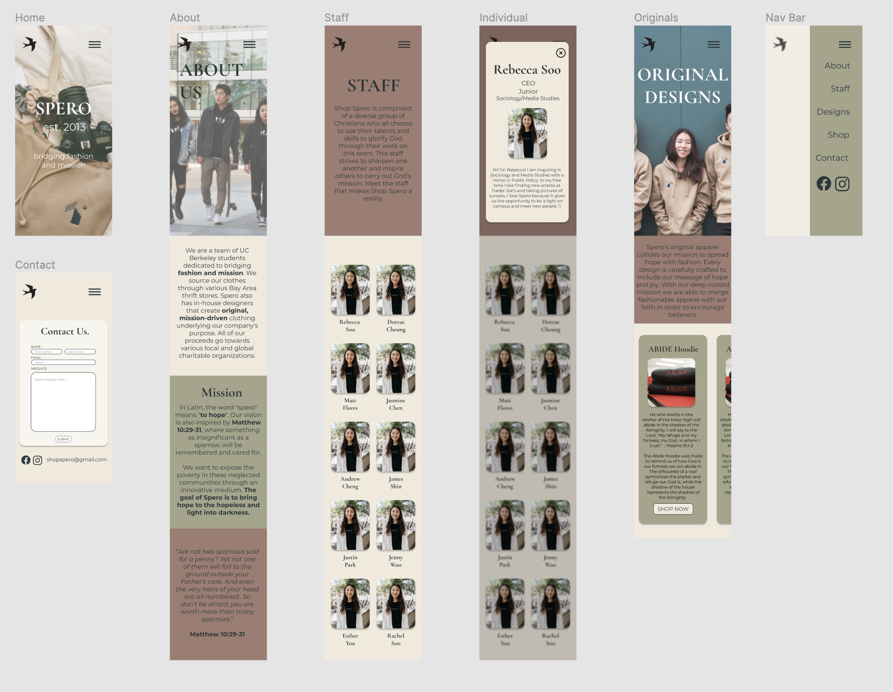
As the web team, consisting of James Shin, Carly Feng, Christie Lum, and me, began work on the website, I, acting as the UX designer, created the basic wireframe on Figma, including the home, contact, about, and staff pages. I worried mainly about user flow and brand cohesivity. The most important things were to keep the color scheme and general feel the same, so we could move elements around slightly to make it easier on us as we worked on the code structure. While our main color was a light brown/cream, we were given a collection of possible accent colors, as seen in this wireframe.
At the same time, I worked on creating a mobile wireframe to match the visual aesthetic of this design iteration, and so I focused on minimalizing the text, converting the design to a more mobile friendly layout to accommodate touchscreen. As such, everything is much more vertically oriented, and I also designed a collapsible navigation bar to make the mobile site easier to use.
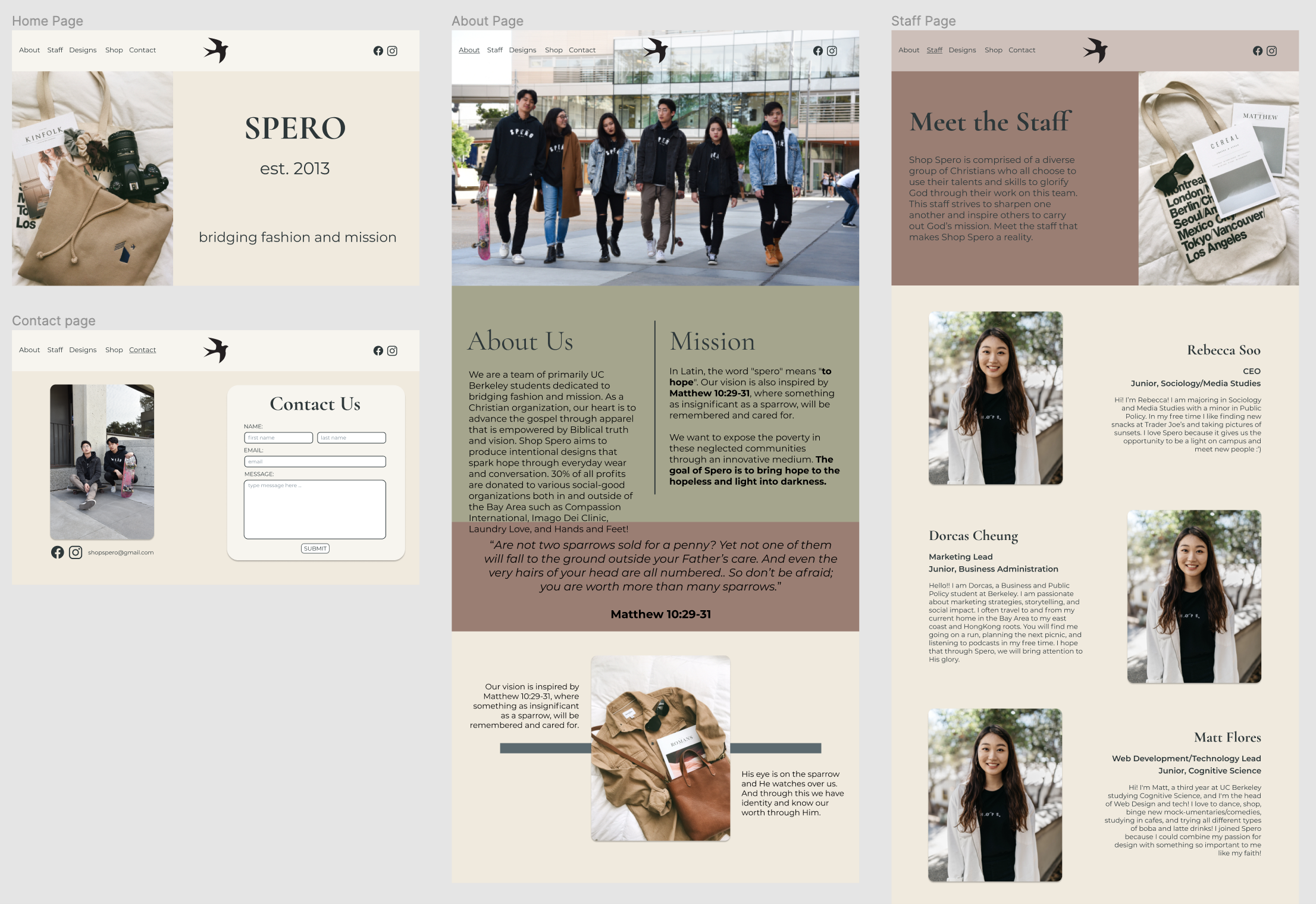
After gathering feedback from James and the design team, I began work on the second iteration of the wireframe, focusing more on the layout, typography, images, and overall atmosphere. After gathering feedback from the Shop Spero team, they felt that the website should be minimalistic and plain, so that our products and pictures would stand out more. With that as my inspiration, the second wireframe refined the color palette to be the cream and olive green, kept the layout very plain, and relied on our images and text as the main accent/highlight. In addition, I began work on the original designs page, where I designed a drop down system to showcase each of Shop Spero’s original design products. With this iteration of the wireframe, I wanted to focus on the minimalism and letting the content itself drive the user’s eye, allowing for easy and intuitive navigation/user flow.
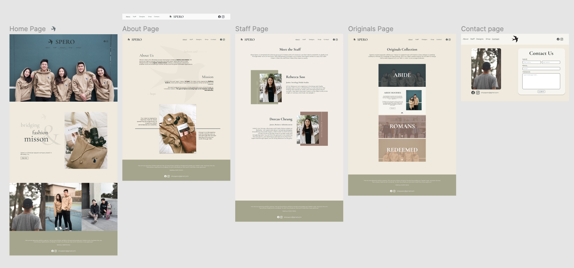
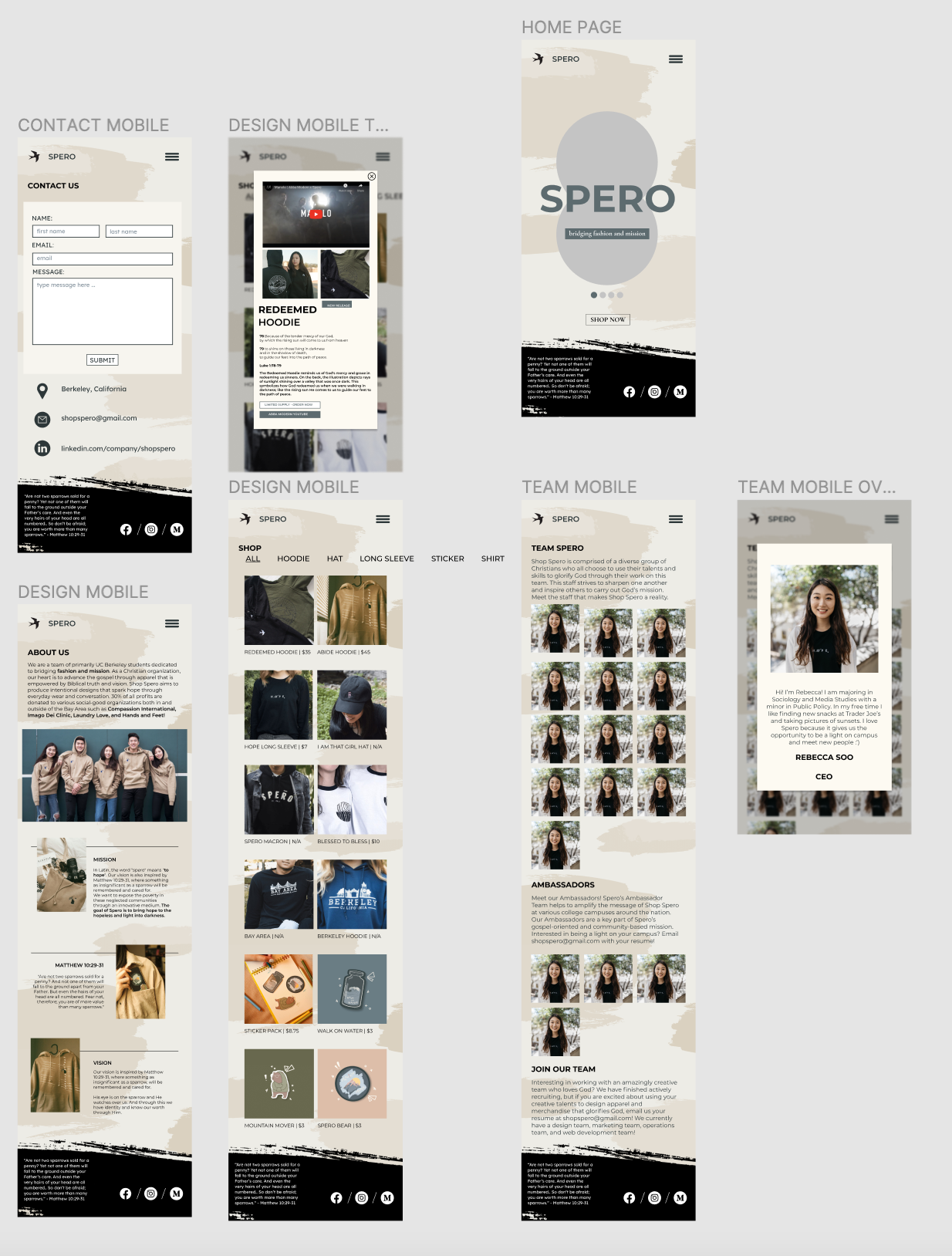
At this point, the team felt that it was time to start incorporating user interviews, survey, and feedback into our design, and we found that the layout, while easy to use, felt plain and lazy to some. In addition, we found that because of the site’s poor reception from user testing, they were less willing to purchase our products. Because of this, we began a third, and final iteration of the site’s design, which focused on maintaining the brand’s chiche identity, while adding some more flavor and visual stimulation to improve user reception. To do this, I was inspired by our grassroots, from-the-ground-up company founding, and decided to play with the paint stroke motif, to symbolize how even the simplest first steps can make impactful contributions. The design lead and I were able to design a background and footer with this paint stroke motif that doesn’t distract from the main content while adding more visual stimualtion to the page to make it more exciting. The home page itself pulls direct inspiration from the brand guide, and the design page pulls inspiration from instagram to better display the products we sell.The site layout itself reamins simplistic, but more interactive to engage better with the user.
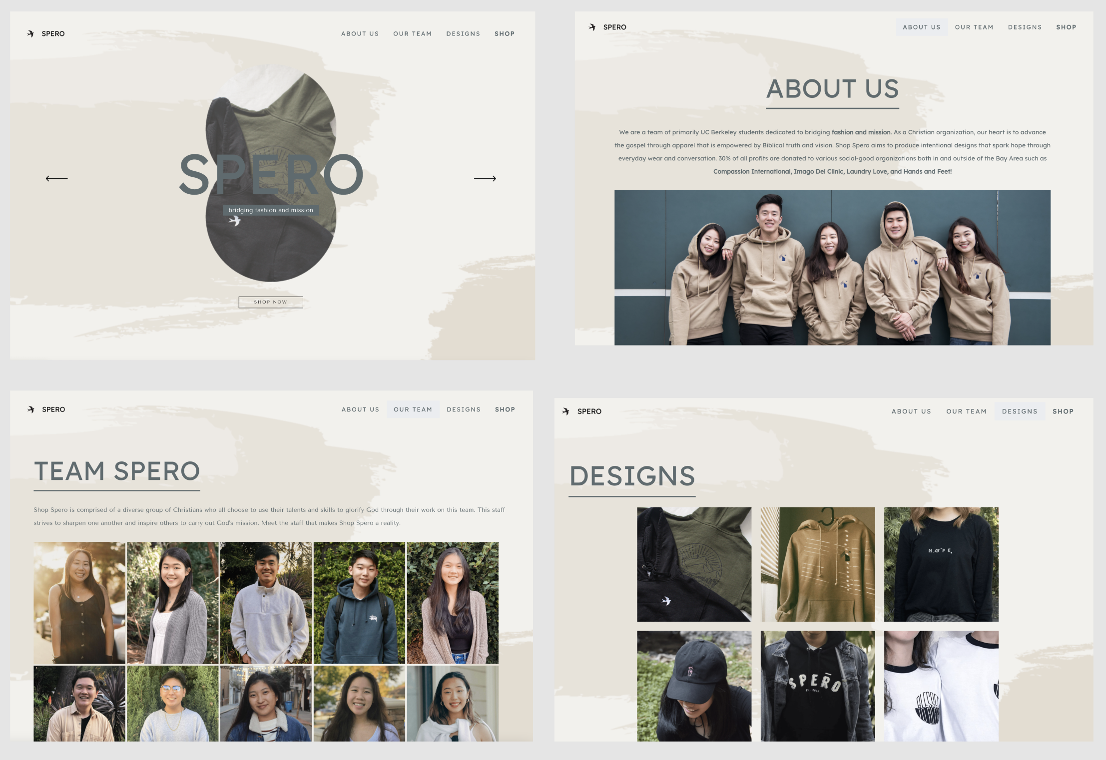
Alongside this final iteration of the site design, I also wireframed the mobile adaptation of the site to be responsive as well. It adopts the same paintstroke background and footer from the desktop site, but the content and layout is adjusted to better suit touch screen devices (swipe functionality). This mobile design relies more heavily on pop up banners to showcase more information so that the landing screens stay clean, concise, and easy to navigate.