YHWH Apparel - UX/Product Designer & Front End Web Dev

Wireframing, UI/UX Design, & Front End (Fall 2019 to Spring 2021)

Tools:Figma, HTML, JavaScript, CSS, React.js, Chakra UI, Gatsby, GitHub, Notion, Slack

Collaborators: Peter Thompson (YHWH Apparel VP), Emily Shaw (YHWH Apparel Design Staff)

Design and Wireframe

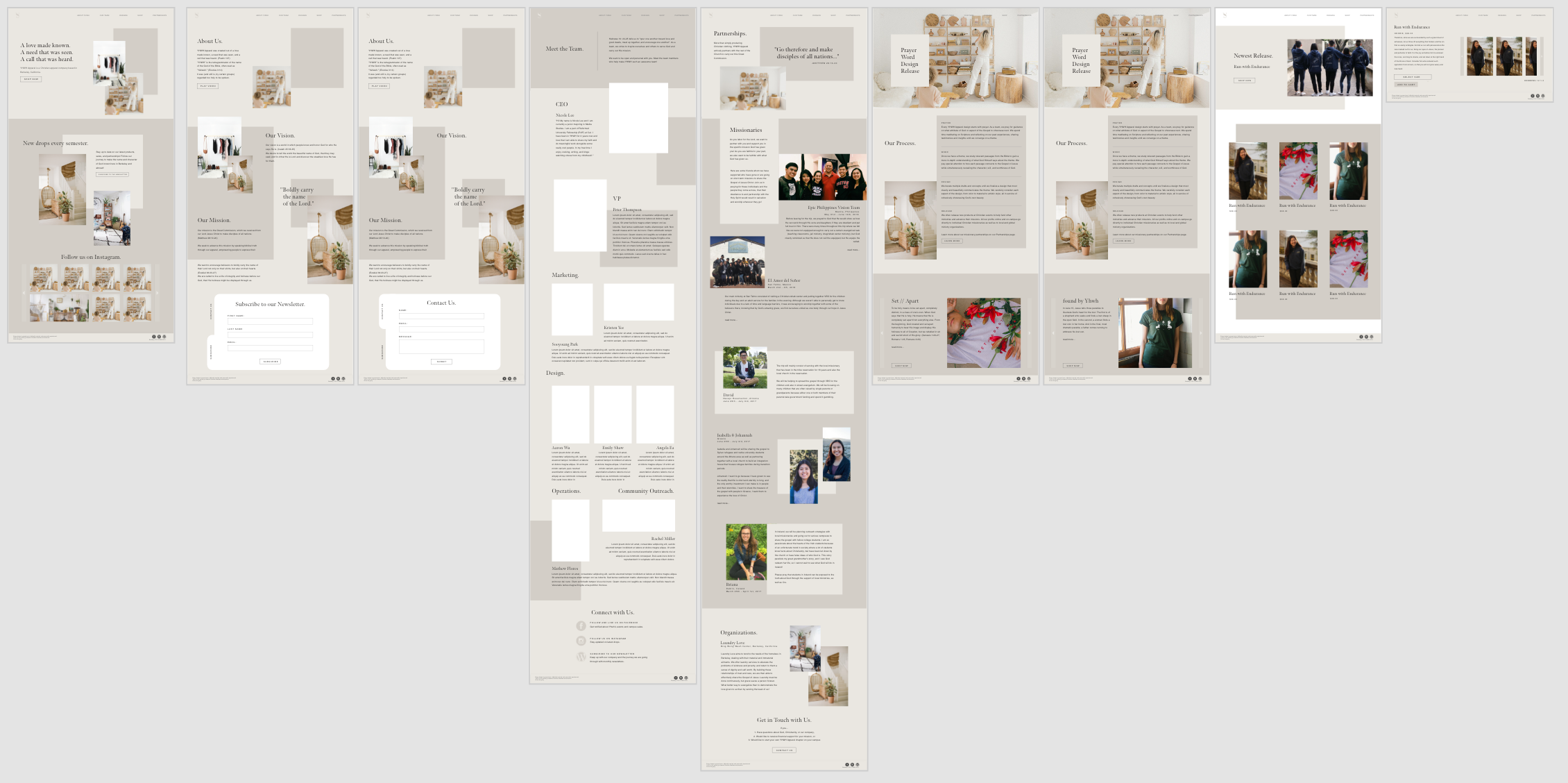
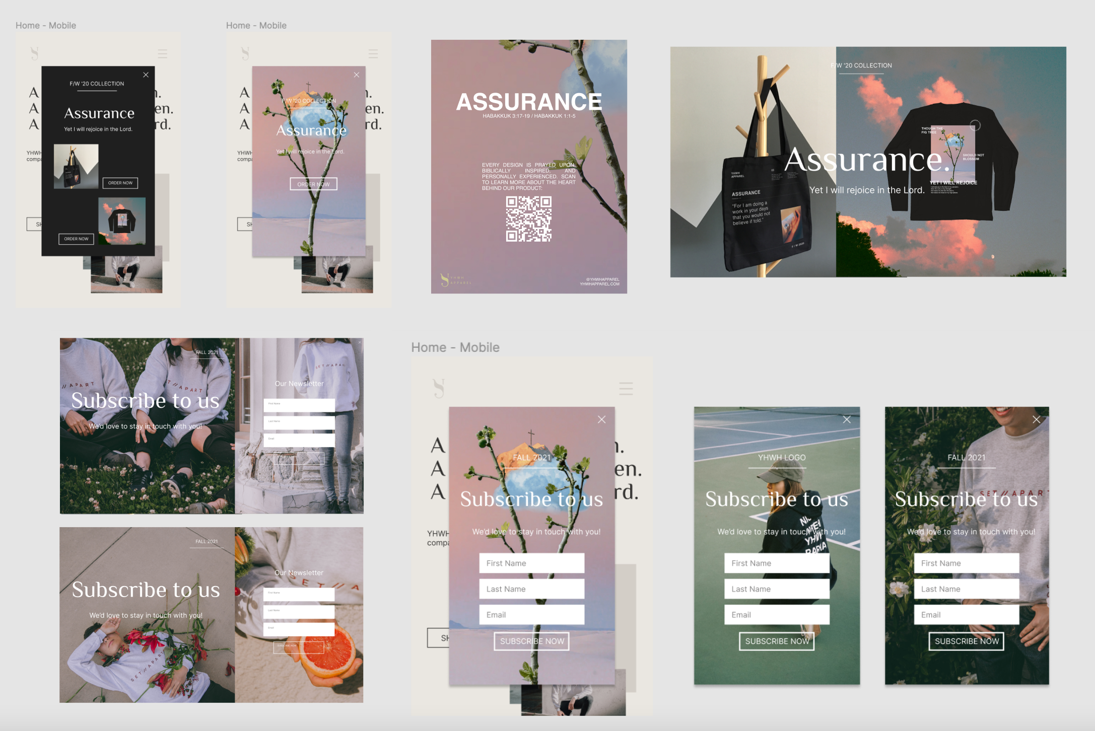
Originally being apart of the Web Development team, Peter and I were handed a completed desktop wireframe from Emily and were able to work directly from it. The most important things were to keep the color scheme and general feel the same, so we could move elements around slightly to make it easier on us as we worked on the code structure. While our main color was neutral browns, we were given a collection of possible accent colors, seen below.

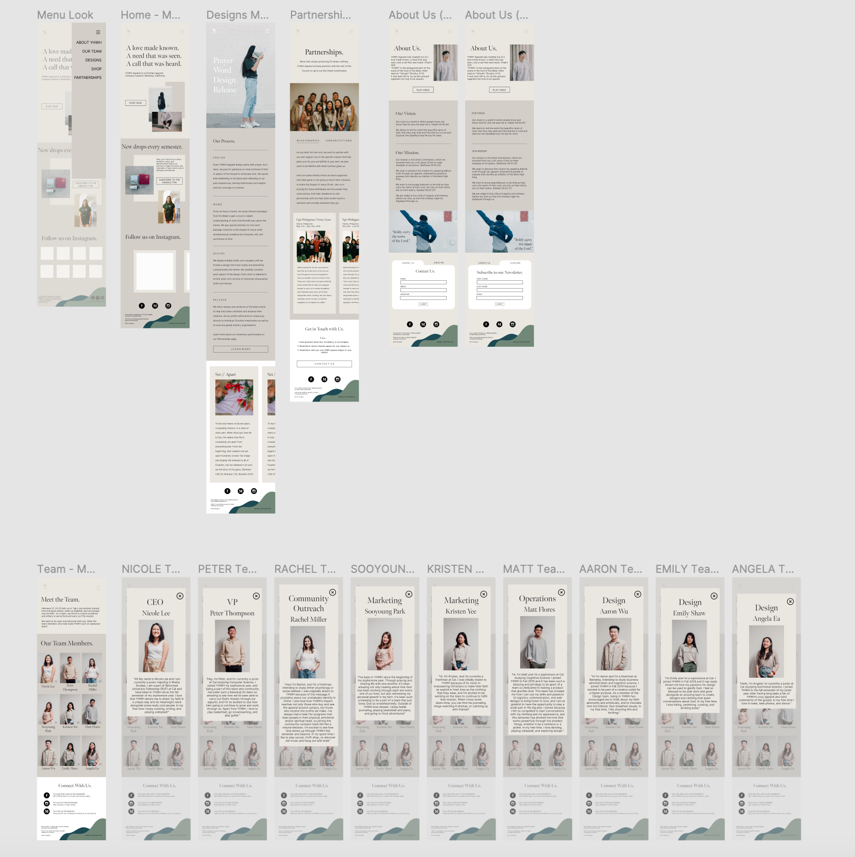
When the time came to begin work on the responsive design for both mobile and tablet platforms, I was apart of a 4-person summer team. This meant I worked on both web development and design, so I was able to work in collaboration with Emily to create the wireframes for the mobile and tablet screens using both Adobe XD and Figma. The tablet screens for the most part were the same as the desktop screen but had a few adjustments to fit the sizing and touch screen. However, the mobile screens went through a more drastic change to fit the screen size adjustment. We had to simplify elements like our logo and navigation bar, team page, and designs page, among others, in order to better display all our information effectively on this platform.

Desktop Web Development

Being one of two members in the Web Development Team, I collaborated with my superior and mentor, Peter, to learn more about the web development process. I began shadowing and observing him as he worked on the home page, and then began working on my own respective pages once I gained confidence. We began by working on the same laptop, but as I gained more independence throughout the project, we moved to separate computers and used GitHub as our main method of collaboration. We utilized HTML, CSS, and JavaScript, relying heavily on the React library.

We worked first on shared components that would be shared on every screen, such as the navigation bar, logo, and footer, as well as more complex components that we decided to put in their own file, such as our design carousel. After, we began work on each of the individual pages, where I was responsible for the team and partnership pages. In the wireframe handed to us, we found these colored rectangle boxes that floated in seemingly random positions that added dimension and color. We had issue in trying to implement these as images, and so we used basic problem solving to figure out that we could use empty image containers as color blocks. The whole process was filled with problem solving and constant web research, since we were both somewhat new to Web Development, but we ended up quite happy with the end product for the Desktop screens.

Responsive (Mobile and Tablet) Web Development

The Web Development team pushed back this portion of the project until the summer due to COVID-19 and the shock it left the team, since we were all college students at UC Berkeley who were suddenly returning to our respective homes. However, after the Spring 2020 semester had come to a close, we felt as a team that we were adjusted to this new work environment and were able to resume this project. With a smaller summer team, the new design and web development side team consisted of Emily, Peter, and me. As mentioned above, Emily and I collaborated to make the wireframes on Figma for the new mobile and tablet pages. Once approved, we as a team used notion to delegate tasks and keep us well organized/managed.

Once tasks were delagated, we were off to work and once again utilized GitHub to collaborate, but also used Slack as a way to communicate effectively, as to minimize merge conflicts. I was first tasked with working on the mobile navigation bar, where it would be a tap-to-trigger "hamburger" menu that would trigger a column of screen options on the right side of the screen and redesigning the logo used to navigate to the home page (no text, just the "y" logo). My teammates worked on other components like the footer and the selectable scroll function. Once all shared components were fully implemented, we then began work on the actual screens. I was responsible for the home page and team page. For the most part, I kept the home page pretty faithful to the original desktop screen, but I made heavy altercations to the team page to better fit the mobile screen. At first glance, each member's profile image is viewable. Each image is then tappable to trigger an overlay box that displays each member's respective "bio" and profile. After we finished building the separate components and screens, we stitched all the pages together using media queries to select a screen based off of the user's screen pixel dimensions.

Banners for Marketing

Alongside Emily, I ideated, designed and implemented several banners throughout the the development of YHWH Apparel's website to promote the subscription to our webletter and for the "Assurance" product launch. For both of these banners, we wanted to maintain the branding identity of the company while also utilizing new imagery to pop and stand out. For the "Assurance" product release banner, we used imagery related to the product theme and the product images themselves to help market, and for the newsletter subscription banner, we used this opportunity to highlight old designs and highlight the work we have done in the past. You can see mockups of both banners in desktop and mobile views, as well as the "Assurance" QR product card below:

To view the final website, please click on this link.